Adam Lambert

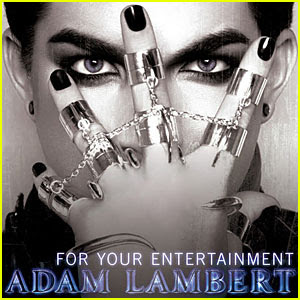
This Adam Lambert album cover shows Adam himself on the cover. We see a close up of his face however it gives the oppinion of an extreme close up of his eyes because of his hand covering the rest of his face. He is wearing a hand/finger bracelet as wel as black nail varnish and a lot of heavy dark eye make-up.
The cover as a whole has a very dark feel about it which shows with the dark make-up and clothes together with the darkness of his eyebrows and hair. The cover is also in black and white where the only colour comes from the name at the bottom of tha album. This is in a violet colour with a bold capital font. It stands out well against the black and white background. The other writing on the cover is the title saying 'For Your Entertainment'. The title is in a smaller font than the artist's name which is unusual for an album cover as the title is usually the main focus. I think this is because Adam Lambert wants to show how he is more important than the title as he is the star of the show. The title also follows the style of the rest of the cover being in black and white. It is a white colour but stands out because of the darkness behind.
In the cover Adam shows a modern representation of a male by wearing make-up and jewellery. This is unusual for a male as it makes them seem less dominant and powerfull. however, In the photograph used the effect is the opposite as the pose Adam is showing is stern and in control bringin back the secure dominant feeling. I think it is the use of his eyes being the main focuse within the album helps to bring this out, which would explain the use of heavy eye make-up as it enhances the focus on the eyes.
Kylie Minogue

This Kylie album is similar to the Adam lambert album in that they both have a close up image of them self on the cover. The kylie photoghraph is a close up with her head tilted slightly to the side helping show her sexy side. She also has her hands framing her face with one finger on her lips again showing off her sexy side.
Kylie has her hair pinned out of her face, showing more of her skin. There are no clothes visible yet you still cannot see a lot of skin because of the angle of the photograph. She has red nail varnish and lipstick and as well as an artistic red and black eye pattern around what appears to be both eyes. The pattern is sharp and shows a contrast between the pose she is showing which makes her seem feminine, sweet and inviting, and the pattern which givers off a mysteriously dangerous feel.
The background used is a plain white backdrop however there are red material shapes around kylie which makes it look as if there is some kind of flower or material in the background and surrounding kylie. She is alos holding one of these material shapes in her hand which shapes her face well. The colour matches her make-up colour and also makes her look more feminine. The font of the title and her name are matching, and also match the eyes make-up she is wearing. It is a slashing blod italic font in black which stand out agains the background. The title has a black heart attached to the top which appears to be on Kylie's neck giving the appearance of a tattoo. The font seem to flow across the cover from the name to her eyes to the title in the way that she is signing an autograph.
In the cover Kylie shows a traditional representation of women in that she looks very attractive. She cares about her appearance and how people see her. In contrast she also shows us a tradition representation by looking very in control of her self and inviting to the opposite sex. This also shows because of kylie having her finger in her mouth in a sexual way.


No comments:
Post a Comment